When LOVE SEX DESIRE came to me this February, it came in the form of a podcast series. This podcast series wanted a pretty promo image with my face on it. This called for some new photos. Once the photos happened I realised the podcast series also wanted a new home to live in. This called for a website redesign.
I had been wanting to revamp my website for the past 18months but every time I tried to “think” about what I wanted to create nothing would flow.
But now, it was all flowing.
In fact, for the past 4 months I have felt like a vessel of love and creativity that is continuously pouring right through me. It’s been one of the most bizarre and beautiful moments of my life.
Today I’m sharing with you the inspiration and intentions of all that is susanafrioni.com.
The photos
The amazing and talented babe I chose to work with to capture my photos is Bayleigh Vedelago. I met her at my friends book launch in February. Whilst I had never had a face to put to her name, I was already a lover of her work.
For some strange reason though, I thought she lived in Sydney so the thought of working with her never crossed my mind. But when I discovered she was a local babe, all of that changed. Bayleigh also captured the magic of my Sacred Dance Party.
If you’re after some awesome photos and someone who takes the time to really understand what you’re creating, I highly recommend working with her.
The Intention:
To capture the essence of my soul and the energy of LOVE SEX DESIRE.
The Inspiration:
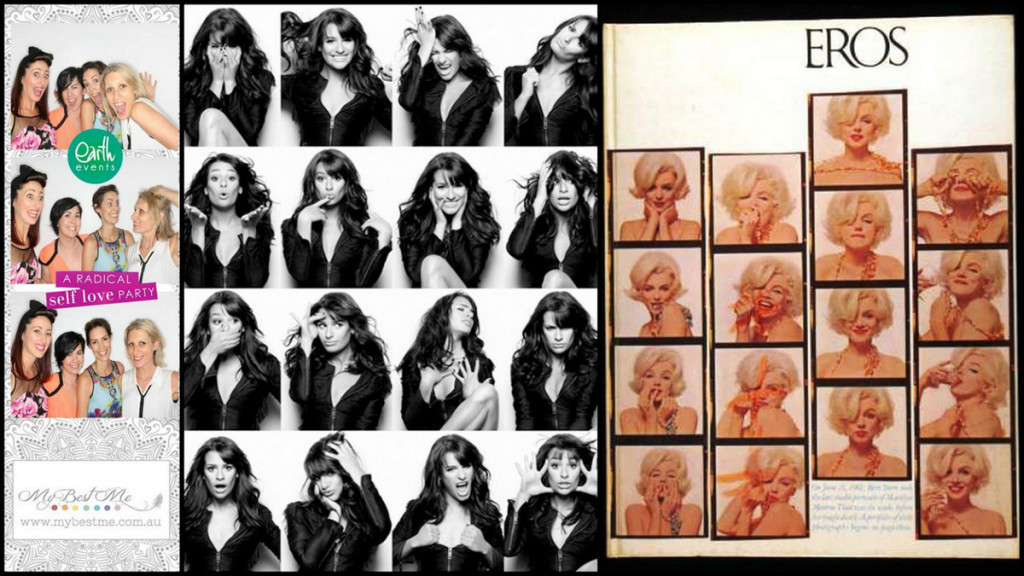
It all started with the photo booth photos from the Radical Self-Love Party back in November 2013. There’s something about photo booths that bring out the FUN in people, including myself.
Then I discovered this fun project and fell in love with the whole photo booth thing even more, especially in classic black and white. To top it off, during my deep dive into all thing Eros, I stumbled across a book with these gorgeous photo booth pics of Marylin Monroe.
All in all, I really love the simplicity and power of the same frame capturing different expressions. Plus, I wanted the images to be really versatile so I could use them on a variety of platforms for a variety of reasons.
The Outcome:
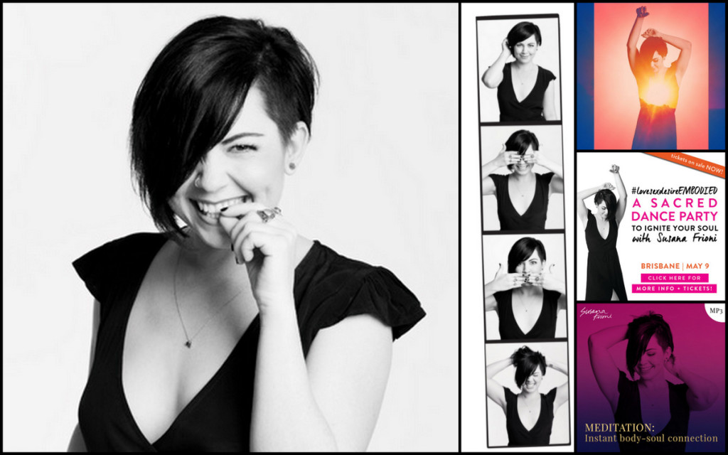
One simple black dress with a low neckline (which happened to be called Venus, my star-sign ruling planet).
Accessorised only by my everyday jewellery.
In a studio against a white backdrop.
With my LSD Photoshoot playlist cranked.
And photos that ooze everything I hoped they would.
My logo/brand
When my designer Stephanie Annabelle sent through her questionnaire, I never anticipated that I’d be sending her an epic 25 page google doc…but I did! Picasa and I became best friends as I created collage after collage of my inspiration to really capture what my words couldn’t.
The biggest challenge I had during this phase was unravelling what was “me” and what was “LOVE SEX DESIRE”. Naturally their energy was very similar, but there were some distinct differences that I needed to pay attention too.
The Intention:
To create a logo that felt powerful, feminine, raw and authentic.
The Inspiration:
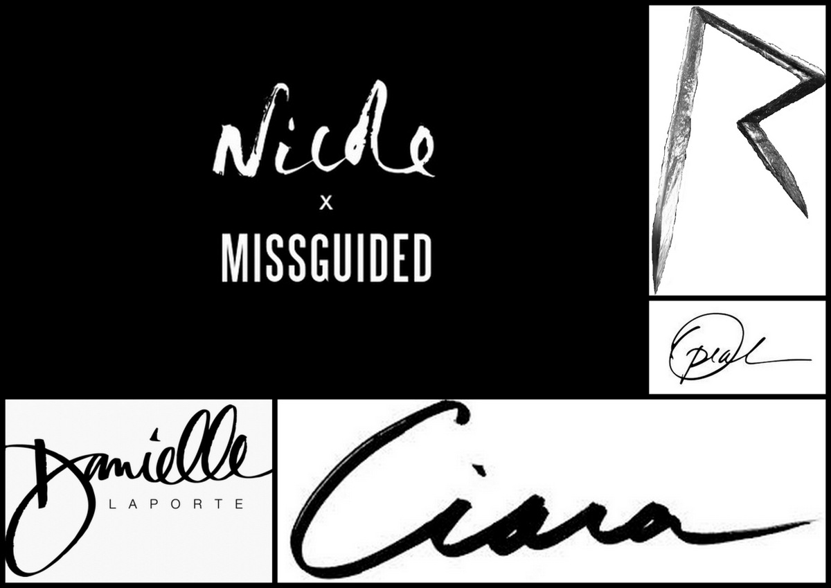
I was drawn to the casual handwriting, especially when teamed up with a modern and clean font. I liked the contrast and the balance of masculine and feminine elements.
I was also really drawn to designs that emphasised the first letter of their name like Rihanna and Oprah.
The Outcome:
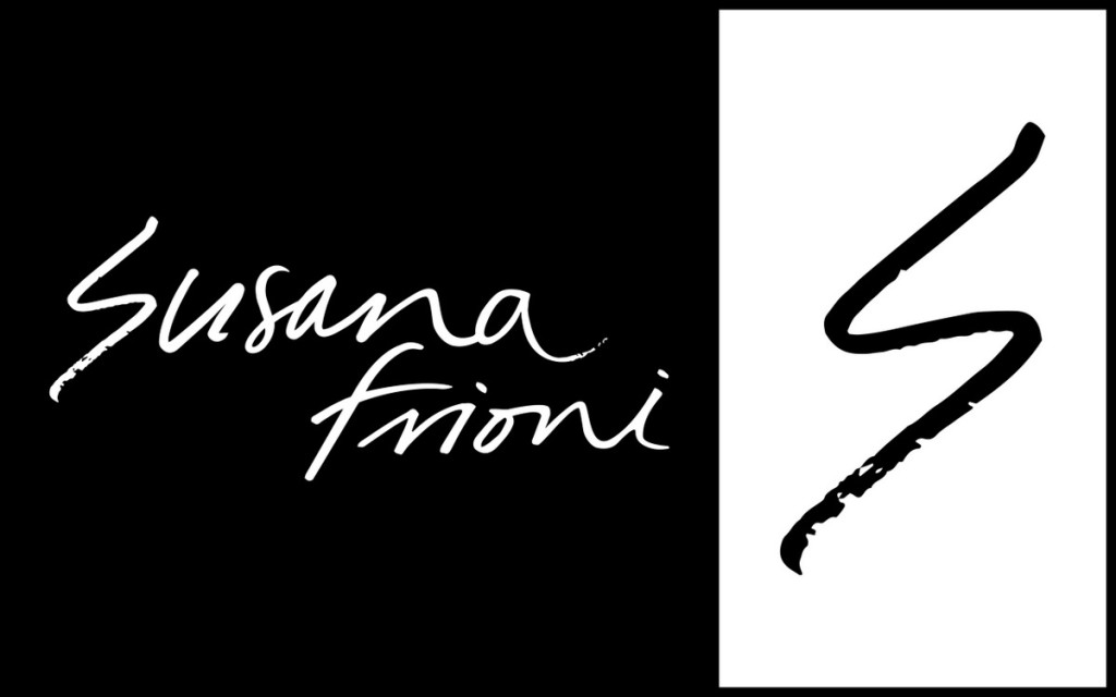
My full name in the same custom made font that is so identical to my handwriting it might as well be mine (but it’s Steph’s…although I swear she scoped out my instagram feed). Plus, an “S” shaped like a lightning bolt to represent one of my soul essences and all that it embodies.
The WEBSITE DESIGN
When I first launched this website back in 2010, it was all black with white text and magenta highlights. A year later, I flipped it to all white with black text and magenta highlights.
Moving forward with the new design I knew I wanted the black and white to have a strong presence. For me it represents contrast, dark and light, yin and yang, freedom, power, balance, sexiness and elegance. I also wanted the magenta to carry over as the primary colour as it’s my personal favourite colour, the one that fills my home and my wardrobe.
I also wanted a design that was bold but also easy on the eyes. I wanted something that was fresh and clean but potent and powerful.
The Intention:
To stay true to my love of black and white.
To add a big injection of colour.
To create an online home that feels empowering, provocative and real. An online home that feels like me. And an online home that has women feel like this…
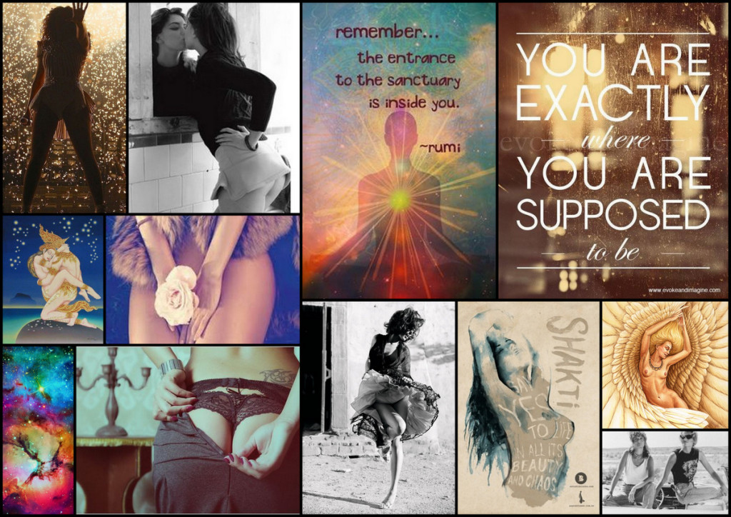
…free, bold, alive, feminine, intimacy, love, whole, playful, adventurous, ecstasy, soulful.
The Colour Inspiration:
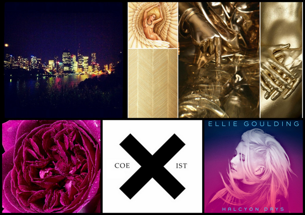
My colour inspiration came in the form of:
- Colour bleeds. In this case magenta and indigo.
- Rainbow city night lights. Makes me think of chakras, all things LBGT and kaleidoscopes.
- Gold. Goddess Freyja who is helping me birth all things LOVE SEX DESIRE is also known as Lady of Gold and after a kinesiology session where I found myself swimming in liquid gold and making love to the elements, it was super important to infuse some gold into my new online home somehow.
The Visual Style Inspiration:
A snippet of some of the visual styles I love.
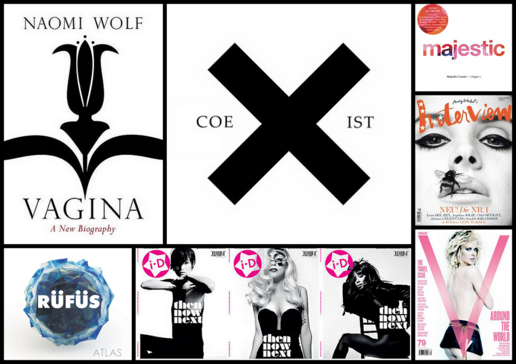
Black and white. Strong fonts. Bold lines. Colour pops. Feminine feel.
I also included a list of what I didn’t like when it comes to visual design. This list included:
- Fluff. If it serves no real purpose, it’s gotta go.
- Bold taken too far that it feels aggressive/pushy/invasive/tacky.
- Delicate/intricate. It’s not me.
- Clutter and chaos. I don’t want to add any more overwhelm to my tribe.
The Outcome:
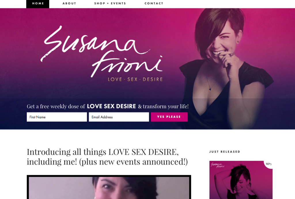
A magenta/indigo colour bleed header.
The cheekiest photo from my photo shoot.
LOVE SEX DESIRE dipped in gold placed discretly underneath my super sized name.
Black text on a white background with magenta hyperlinks.
A modern clean font teamed up with a more textured/elegant font.
Bold black lines and boxes.
Blog posts with feature images and some teaser text.
A side bar that’s simple and straightforward.
A footer dipped in black.
As for the other rooms/pages of my online home…
There’s an about page that feels real, sincere, personal and potent.
There’s an about page that combines my love for storytelling, poetry and photo collages.
There’s an about page that combines my love for writing, speaking and capturing photos.
Then there’s a shop page that is clean and simple and right to the point.
Then there’s a contact page which is also clean and simple and right to the point.
Everything about this online home has a purpose, has meaning and is all infused with my soul.
The Blessingway & BIRTH
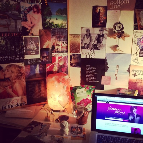
I hadn’t announced what time the site was going live on Friday 13th simply because I didn’t know. The night before I told Steph we’ll aim for late morning but as the day unfolded it became clear that this baby wanted to be birthed under a full moon rising.
Before launching I called my soul sister Nicole Rowan Holt, the most amazing doula I know helping women birth projects (and babies) into the world. Seriously, the space she holds it’s magical and profound.
She had me create an altar in a space that felt most aligned with the energy being birthed. I chose my office because it’s my playful creative sanctuary filled with inspiration, love and wisdom. She then had me gather specific items to represent my 12 soul essences, my desires and my money.
Nic’s kids then pulled some cards for me (a common ritual we do often).
She channeled a message.
And I declared I’m ready.
In closing, Nic asked me to choose a song to birth this energy into the world. As I went to click over to spotify I “accidental” hit the wrong button and Rhythm is a dancer started playing. We were both flooded with memories of losing ourself on the dance floor. This energy was one of total freedom. And with that, we took to the outdoors and danced under the bright full moon.
When all was done, I text my designer Steph to press LIVE with the same ecstasy she felt at my Sacred Dance Party and volia…here she was.
Now that’s what I call an orgasmic birth.
There are still a few more rooms in the making which I’ll be revealing to you in the next few weeks, so stay tuned! Until then, I hope to see you at a Sacred Dance Party super soon!
Big Love
![]()

OH HONEY. I absolutely loved reading this. Purposeful intent and meaning – you sure know how to speaka ma language. The result of all that deep thought is a site that could not be more you. Susana’s Abode. She’s a beauty xo
Thanks beautiful lady! XO
I am so in love with your website, Susana. Thank you, thank you, thank you for sharing your creative process, the inspiration, intentions and especially the magic behind the final “ta da” website. You inspire me to let more of myself into the world. Can’t wait to attend your Sacred Dance party in Melbs too xx
Thanks Kate! Look forward to seeing ‘more’ of you on the dance floor in Melbourne! XO
I loved reading this Susana. Thank you for sharing and the amazing insight. So much magical energy has gone into the whole process. Loving the empowered feeling I get from your posts. So much gratitude coming your way. Enjoy the gifts your amazing journey is bringing xx
Thanks Sophie! XO
I love! So you. Sexy and mysterious energy. Just LOVE!
Oh Susana.. this is such a beautiful and inspirational process.. The website is beautiful and your message is so powerful.. Gratitude from rainy Prague**
A beautiful wrap up Susana.. loved seeing the process through your eyes! It was a pleasure to create this baby with you xx
Steph, you are the BOMB! XO
Dude – this is BEAUTIFUL! I’m at the beginning of this process right now – love your words + work xx
you never fail to inspire. thank you, always.
LOVED reading this post. I adore your new home <3
So beautiful. I loved reading the journey and birthing of your site! So inspiring! I think I’m a new number one fan of all that is Susana Frioni! :) Divine. Thankyou for sharing the intimate details of how this awesome online home of yours came into being! Super inspiring! :) x